Posts

Wrap up

Image
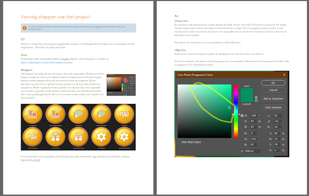
This week is the last week of the industry project for game design and technology. We need to deliver the project and present it to the stake holders.  We will not work to much on the project anymore but we focused on developing the project with the right documentation so our stake holders could eventually develop this game by their own. And we also worked on preparing the presentation.  How can I create an document which allows feature developers to continue our project? I started with looking up what is important in such an document. I came across a couple of documents from the most basic ones to the extreme detailed documents. The advice rapport can be as detailed as one is willing to spend time on it. It also depends on the scope of the project. The bigger the project the more things need to be explained.   I firstly created a document and then filled in the chapters about the graphical parts of the project. Because these were the main focus for me this last couple of weeks. I

UI elements

Image
How can I make sepreated UI elements for my fellow team members to use? Last week I did some research about home screens in game. This week I used my own product as a available product analysis . To create new Ui elements, which suits our games style. This week I created a Quiz item for our game. I took in consideration the home screen design, which I created last week, when creating the Quiz item for the game. Afterwards we got feedback from the teachers how I could make separated buttons without filling them in with icons or text, so that the devs could use it for places where they need it. Of each button I created 3 variants. Normal, Pressed and Inactive. I also created one new prop for in game and updated the home screen UI. And we decided to have a status, or better said, condition bar in our levels. To see the current state of the level. So I came up with a condition bar which is full and green at the beginning of the level with a green happy smiley. And when the condition l

Designing the homescreen

Image
How can I make a good appealing and clear home screen for our game? Research: I started with  Available product analysis   I downloaded a couple of trending games from the Google Play Store. And did some research on how they created these home screens. I noticed that all the games have first a splash screen of their logo, or the company logo. And afterwards they show a loading screen. When the game is loaded we can see a home screen. The most games have a Play button and a settings button. Allot of stuff is hided behind the settings button.  I also noticed a theme music on most of the home screens. A lot of these games also have some kind of a connect to Facebook button. What also is worth mentioning is that all of these home screen fit in the main style of the game. I then did  Literature study  and came across a website in which they explain about different phone screen ratios. And why it’s important to keep in mind these different ratios. They also explain on how to do this.

2D isometric character design

Image
How can I create an character in 2D isometric art style? research Like the most researches I do I start with  Available product analysis . I like this method cause it gives me an overview of the already existing products. It also give me some inspiration. I’ve searched for character art in 2D isometric style. I came across a couple of samples. And with the knowledge from the previous weak I’ve started creating my own character. I did adjust the grid size on my view though, cause I needed more details in my character. In the research of last week I found out that creating rounded objects were difficult that why I decided to make a blocky character because of the details. Conclusion: I’ve created a character which suits our design and theme. The character can be seen in the image above. I was planning to upgrade the character design to a more rounded form. But I kind of like this style. So I will discuss this with the group. And if they agree we can keep this blocky character style.

Game pitch and 2D isometric art

Image
Research strategies and methods used:   Library Available product analysis Literature study Workshop T utorial Showroom Pitch Game Pitch This week we’ve started the week with a Game pitch. We’ve created the pitch last week. The pitch gave our clients and the teachers an idea of what we are going to build this semester for game design. It describes the main areas of our game. Thanks to the pitch both the teachers as the clients now know what to expect form our project. They also gave us feedback which is an essential part for our development. We’ve applied the feedback in our project. After the pitch we’ve created user stoeries in Devops to work on. I was assigned to make the art for this sprint together with Martijn, another team member. How can we make isometric 2d art for our game? I’ve firstly searched for existing games which use this kind of art style. I found an awful lot of examples, not only games but also other media which use 2d iso

Game document and contact with stakeholder

Image
Research strategies and methods used:   Library Available product analysis Field Stakeholder analysis Workshop Brainstorm Brainstorming We started this week with a couple of brainstorm sessions. We covered a lot of ground in this session. We generated and developed ideas. In the brainstorms sessions we discussed different subjects like Story, Kinds of Fun, Perspective, Genre, Theme, setting, MDA and the Core-loop. We documented everything in our game document. Later on we talked with the teachers about our results. They gave us feedback and we processed their feedback in our game document. After the meeting we looked at the difficulty of the game and balancing of the games difficulty. We started to think about how we can approach our target audience.   We updated our game document with the new information we gathered. We also did analyze our stakeholder and the clients of the stake holder. To get a better understanding of the people which are eventual ta

Industry Project Kick Off

Image
Research strategies and methods used: Library Available product analysis Community research Literature study Workshop Brainstorm Industry project kick-off We kicked this week off with a presentation of an external client. The client is an insurance company. In short, the problem they have is that a lot of fire damage is caused by human actions. That’s why they want us to make a game which will teach the users how to prevent fire. After the presentation we wrote a debriefing and send this to the client. We did a brainstorming session about the game concept and documented this. And wrote an design challenge document together. After this we focused on the research question and the sub questions. We came up with the following questions: Main Questions: How can monetary damage in fire incidents be limited? Sub questions: What are the most common causes of fire? How can you apply technology to educate people about fire prevention? How ca